Go Back
Finding a perfect layout
- 4 minutes -
I already had with 2 things in mind:
- heavy use of typography
- or something that looks similar to a code editor
I wanted to create both a piece of art and something that expresses luxury attention to detail. When I find myself daydreaming about a design, I almost always try to find something similar on dribble. This way I make sure I don’t forget what I previously imagined. This time I looked up clean and minimal creations and after scrolling a while I eventually found inspiration.
Jordan Hughes, if you ever read this: Thank you!
After recognizing the whole design consists of only one color and its shades, I immediately had in mind that anyone should be able to select their color of choice. Funny enough, the color picker was the first thing I finished, even before I knew of the heavy use of typography.
As for the typography part of the design, I just wanted it to be close to handwriting or typewriting. Basically anything that reminds of real paper. And text alignment should be as perfect as in the newspapers, especially baseline grid.
As I worked my way through setting up the text styles, I came across the question if and how to render images. They are kinda difficult to handle, since their height often doesn’t match the baseline grid and therefore shifts text. Ideally, their size just magically snaps to the according baseline.
Unfortunately, this is not how CSS works and I finished my first draft without supporting images. That sucks. And is hard to explain, even to other developers.
However, since this post already contains some screenshots I still got them to work within the layout. In the end it was way easier than I thought.
---
type Props = astroHTML.JSX.ImgHTMLAttributes;

const { src, ...props } = Astro.props
---

<astro-image>
    <div class="py-[1rem]">
        <img src={src} {...props} class="mb-[calc(1rem_-_mod(calc(100%_/_var(--img-aspect-ratio)),1rem))]" />
    </div>
</astro-image>

<script>
    class AstroImage extends HTMLElement {
        constructor() {
            super()
            const img = this.querySelector('img')

            img.addEventListener('load', (e) => {
                img.style.setProperty('--img-aspect-ratio', (img.naturalWidth / img.naturalHeight).toString())
            })
            img.style.setProperty('--img-aspect-ratio', (img.naturalWidth / img.naturalHeight).toString())
        }
    }

    customElements.define('astro-image', AstroImage)
</script>
At first, mb-[calc(1rem_... might be overwhelming. But it essentially only calculates the
remaining space to fill a full line. And since margins and paddings are based on container widths, we need some reference to the height.
Here I do this by setting the aspect-ratio as CSS variable. This even enables responsive images. How cool is that?
Here you have a quick demonstration of what’s going on.
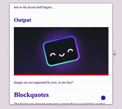
I am quite happy with the result, since this image handling expresses the attention to detail even better.