Go Back
The perfect select component
-
Today I coded some tickets in one of my companies SvelteKit projects. Since beginning to use svelte sometime in july, my colleagues and I have been really happy. It makes fullstack development so easy that even our ticket estimations have to be readjusted, since we are still minded like using heavy backends, apis and stuff. I would have never thought that even backend-loving people could like sveltekit. But they do.
Don’t get me wrong. JavaScript on the server still is a mistake. But for projects where fast iterations and customer feedback is needed, JS is a good fit.
As I walked through todays last ticket I found something ambigious building up in the application: too many different <select> components. There were three of them:
<UserSelect/>
<RoleSelect/>
<OrganizationSelect/>
And the moment I recognized that my developer heart immediatly saw an opportunity to merge all of them together. Somebody might argue, why I wanted a single component so much, when there might be different logic in each of these. Well, there wasn’t.
Refactoring was going well until I stumbled upon the usual problem when creating a generic select component: how to type the incoming and selected items? If you have some frontend experience you know this has never been possible before.
- vue cannot do that
- react cannot do that
- angular… nobody really cares, I guess
- svelte… can do it 🚀
The thing svelte supplies is made exactly for this use case. Credit goes to this reddit post.
<script lang="ts">
type T = $$Generic

export let items: T[] = []
</script>
This comes in handy for other developers using your components. And I can promise you, they will love them. Your IDE will recognize the types of your data and supply intellisense.
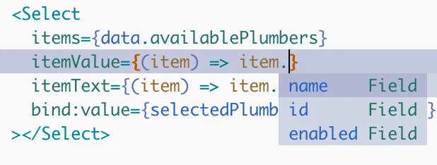
What a great thing.
Here you have access to the source of the <select> component.
<script lang="ts">
  import { cn } from '$lib/utils.js';
  import { ChevronsUpDown, Check } from 'lucide-svelte';
  import { Button, type Props as ButtonProps } from '$lib/components/ui/button/index.js';
  import * as Popover from '$lib/components/ui/popover';
  import * as Command from '$lib/components/ui/command';
  import { tick } from 'svelte';
  import { t } from '@deckweiss/internationalization';

  type T = $$Generic;

  export let items: T[] = [];
  export let value: string | null = null;
  export let itemValue: (item: T) => string;
  export let itemText: (item: T) => string;
  export let variant: ButtonProps['variant'] = 'outline';
  export let placeholder = $t('components.select.placeholder');

  let open = false;

  $: selectedItem = items.find((i) => getItemValue(i) === value);

  function getItemValue(item: T): string {
    if (typeof itemValue === 'function') {
      return itemValue(item);
    }
    return item;
  }

  function getItemText(item: T): string {
    if (typeof itemText === 'function') {
      return itemText(item);
    }
    return item.toString();
  }

  function toggleValue(item: T) {
    const itemValue = getItemValue(item);
    value = value === itemValue ? null : itemValue;
  }

  // We want to refocus the trigger button when the user selects
  // an item from the list so users can continue navigating the
  // rest of the form with the keyboard.
  function closeAndFocusTrigger(triggerId: string) {
    open = false;
    tick().then(() => {
      document.getElementById(triggerId)?.focus();
    });
  }
</script>

<Popover.Root bind:open let:ids>
  <Popover.Trigger asChild let:builder>
    <Button
      builders={[builder]}
      {variant}
      role="combobox"
      aria-expanded={open}
      class="justify-between"
    >
      {selectedItem ? getItemText(selectedItem) : placeholder}
      <ChevronsUpDown class="ml-2 h-4 w-4 shrink-0 opacity-50" />
    </Button>
  </Popover.Trigger>
  <Popover.Content class="p-0">
    <Command.Root>
      <Command.Input placeholder={$t('components.select.search')} />
      <Command.Empty>{$t('components.select.noItems')}</Command.Empty>
      <Command.Group>
        {#each items as item}
          <Command.Item
            value={getItemValue(item)}
            onSelect={() => {
              toggleValue(item);
              closeAndFocusTrigger(ids.trigger);
            }}
          >
            <Check
              class={cn(
                'mr-2 h-4 w-4 text-black',
                value !== getItemValue(item) && 'text-transparent'
              )}
            />
            {getItemText(item)}
          </Command.Item>
        {/each}
      </Command.Group>
    </Command.Root>
  </Popover.Content>
</Popover.Root>
Btw, I still use nvim.